
In previous post, I described the particular dynamics in which electricity production from intermittent energy sources, when growing in capacity, will not increase much at the production valleys, but will steeply increase at the production peaks. This means that, when capacity increases, the needed backup capacity will stay high, even at multiples of the current capacity, but at the same time measures have to be taken to suppress the ever growing peaks.
I illustrated this with a (celebrated) record high of wind production on June 8, followed by a (neglected) low production (June 9). In less than 12 hours, the production fell from almost 3,000 MWh (capacity factor of 81%) to almost 20 MWh (capacity factor of 0.5%). This illustration was only for electricity production by wind energy. There is a complicating factor: solar is also an intermittent energy source and can intensify as well as dampen the effect of wind.
That made me wonder how this interaction would look like when capacity of solar and wind increases over time. In real-life, this is not witnessed yet, this is still to come. It is however possible to study the dynamics of such a system by modeling it.
As I already mentioned several times, I have no problem with mathematical models per se. These are useful tools to study a certain mechanism. Models surely have their limitations though. Their outcome is not necessarily what will happen in reality and the more (uncertain) factors are involved, the more uncertain this outcome will be.
However, the model of the dynamics of intermittent energy on a service based grid is at its core rather simple, there are not that many factors involved and there are detailed measurements of all of those.
This post will be about a very simple model that I created. Maybe I will add more functionally in the future. The program of my choice to build this model is Python and the Pandas module. This module is used for data analysis and can handle large datasets. It is very powerful and lightning fast compared to what I used before. Graphing is done using the matplotlib module.
This is how the simple model works:
- Loading in the data of a reference year (in this case 2018):
- solar production data (production as well as capacity)
- wind production data (production as well as capacity)
- total load data.
- Sum the value of solar production and wind production for every timeslot (quarter hourly)
- Use the multiplier. I used the sum solar + wind times two, three (as expected by 2030), four, five and six (as expected by 2050). I will show graphs for current capacity and the three and six times current capacity
- Compare this with the total load data.
If there is one datapoint missing from or solar or wind or total load, then this timeslot is discarded. There were only 17 discarded timeslots in 2018.
I assume a linear relationship between capacity and production. Meaning that if capacity of solar and wind doubles, then I assume that the production of electricity by solar and wind would also double in the same situation. These simulations are in fact what-if questions: what would have been the effect if in 2018 the capacity of solar and wind was two, three, four, five or six times the capacity?
The model surely has its limitations. For example, I use a reference year, but every year is different from the previous and the next. There will be slightly different numbers of minimum and maximum production and these will occur on different dates. I am however not interested in what happens at individual timeslots, I want to view an overall effect. I also ran the model with the reference years 2016 and 2017, the overall outcome of those runs is very similar.
Another limitation is that the share of solar and wind might change in the future. At the end of 2018, solar had a capacity of 3,369.05 MW, wind had a capacity of 3,757.185 MW. If wind increases relatively more than solar, then the end result might differ. Also here, I am not trying to predict anything, I just want to find some general trend and see what will happen with the dynamic range when capacities increase.
Only solar and wind data goes into the model. There is no data of other power sources (natural gas, import, pumped storage, nuclear and so on). I consider those as a black box. I currently only look at shortages or overproduction of solar and wind. What will replace the missing power or what will be powered back/exported when overproduction is not something that I am currently interested in.
While running the model for the first time, I realized that the capacity of solar and wind had increased during that year. This made it difficult to distinguish between the effect of those energy sources on the system and the effect of the increase of their capacity. Therefor I converted all production values of solar and wind to their capacity of the last day of 2018 (3,369.05 MW for solar and 3,157.185 MW for wind). Again, The goal of the model is to discover the pure effect of those energy sources on the system and this capacity increase in the reference year might interfere with that.
That being said, this is the production of solar and wind of the reference year:

(It is not a coincidence that the y-axis rises well above the maximum 13,000 MW of total load. Those who read the previous post will probably understand why I left so much space on the y-axis).
A first observation is that solar and wind power production stayed well below demand in 2018. Which is not surprising, it is still a small part of our energy supply.
It is also clear that power demand is higher in winter than in summer at our latitude. This because the days are shorter and it is colder, so we stay more indoors and need more lighting, heating and so on.
When viewing this graph at a higher magnification (click to see the larger version), then there is a difference in appearance of the solar + wind line. Peaks are higher in summer and more frequent than in winter. This has to do with the abundance of solar energy in summer and the lacking of it in winter. However, monthly averages of solar plus wind production are roughly in the same ballpark (except for the first three months of 2018). There is more solar power production in summer than in winter and there is more wind power production in winter than in summer. On average one compensates the other. I also came to that same conclusion in a previous post (however, high production does not necessarily coincide with high demand).
In the first three months there was a lot more wind than in the last month of 2018 and also more than in the first months of 2019. So higher production is possible, but it is not guaranteed.
The fact that production of solar and wind power is well below power demand doesn’t necessarily mean that no problems are expected. There were already issues with the stability of the grid with lower capacities than this. This occurred at times when there was a lot of sun and wind, a low demand and other power sources not being able to power down/off quick enough. This is happening in the black box though, so I will not go into detail here.
This is when capacity increases three times (expected by 2030):

Notice the difference in dynamic range between this graph and the previous one. In the reference year, production of solar and wind goes from 2 MWh to 4,338 MWh. In the 3x scenario, it goes from 6 MWh until 13,015 MWh.
The reason for the oversized y-axis becomes clear when capacity increases six times (expected in 2050):
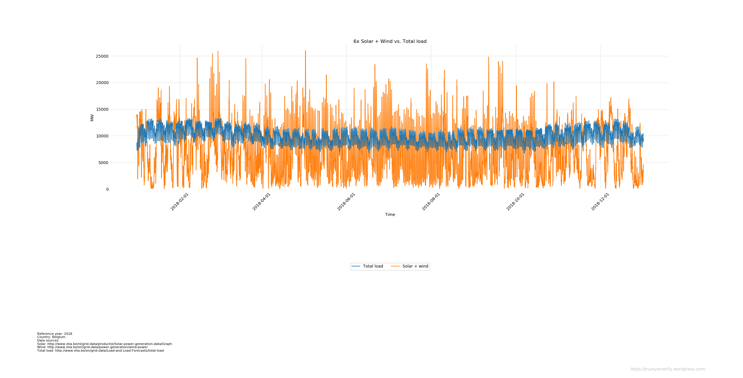
I used the same y-axis in all three cases so I could compare the three graphs with each other. Dynamic range now stretches along the entire y-axis.
The more the capacity increases, the more balancing mechanisms will be needed. Not only those measures to add more power when there is not enough (fast cycling dispatchable power sources, import, pumped storage, demand response,…), but also those when there is too much power (export, pumped storage, demand response,…). Our politicians are not in a particular hurry to take those measures. They are very focused on adding more solar and wind capacity, not in adding the installations that will balance the intermittent power. That is not really surprising. Adding solar and wind to the mix made energy prices soar and then it might be difficult to admit that adding solar and wind was only the first step. The next step is installing (expensive) balancing systems…
There is another way to view the same data: relative to total load. Total load is then at zero and everything below is a shortage (less energy produced than consumed), everything above overproduction (more energy produced than is consumed). This is the reference year 2018:

Because there is no overproduction the blue line (surplus) is a straight line glued to zero.
The deficit curve bends upwards in the middle because in summer we need less electricity and there is more electricity from solar installations. Meaning less deficit that has to be filled in by some other energy source.
Now 3 times solar plus wind compared to the total load line:

Solar and wind stay mostly below total load, but already some peaks stick out. At those peaks, all other power sources have to power off or some other balancing measures needs to be in place, whether it is fast backup, storage, export (get more difficult when other countries bet on the same horse and will have the same problem), curtailment, use the excess production for something else, …) to be able to balance this system.
This is what we get when 6 times solar plus wind is compared to total load:

After increasing the 2018 capacity by six times (that is 20,214 MW installed solar capacity plus 18,942 MW installed wind capacity), deficits are still larger than surpluses.
Here are some numbers that the model spitted out for all multipliers:
| Multiplier | Minimum needed backup (MW) |
Minimum capacity solar + wind (MW) |
Maximum capacity solar + wind (MW) |
Total overproduction (GWh) |
Total shortage (GWh) |
|---|---|---|---|---|---|
| 1 | 13,251 | 2 | 4,338 | 0 | 77,066 |
| 2 | 13,191 | 4 | 8,677 | 0 | 66,685 |
| 3 | 13,131 | 6 | 13,015 | 82 | 56,386 |
| 4 | 13,071 | 9 | 17,354 | 884 | 46,807 |
| 5 | 13,592 | 11 | 21,692 | 3,496 | 39,037 |
| 6 | 13,013 | 13 | 26,031 | 8,204 | 33,364 |
It is clear that the minimum needed backup (the largest deficit of the year) stays roughly the same. Previous years had also similar deficit numbers. Which is also not that surprising: multiply a tiny number by three or by six or even by ten will make not much difference. Multiplying a small number just results in another small number (albeit somewhat bigger than the previous). Subtracting this small number from the total load will result in a deficit that barely get smaller. Even multiplying by 12, the minimum needed backup stayed high (still 12,741), but at the same time maximum production skyrocketed to four times the maximum demand in 2018).
The next questions now are whether theoretically some kind of storage could be used to top off the peaks and fill in the valleys (therefor balancing the grid) and what is the theoretical multiplier to be able to balance the grid with solar and wind only. That is for a next iteration of the model.

This is great. It clearly illustrates what I suspected might happen.
If I got you New York State load and renewable data could you plug it into your model?
Thanks.
LikeLike
It was also what I expected, except that the total deficit was much larger than the total surpluses even after 6 times the current capacity,. It shouldn’t have been a surprise though, just a pocket calculator and the back of an envelop should made that very clear.
Other data could be plugged in the model. I then most certainly have to adapt the loading-in part (and maybe some other things too, depending on for example the frequency and the unit of the measured values). If the data is not in some exotic format and rather structured, then it should not be a problem to plug that into the model.
LikeLike
The New York State load data are available at https://www.nyiso.com/real-time-dashboard. Wind is available by itself but they put solar in with methane, refuse or wood. The data files are flat csv format but need to be processed because they are listed by load control area zones for each time interval. If you think you could model this and are willing I will reformat as needed. Thanks.
LikeLike
csv files are perfectly fine. The structure is not really optimal however, but could be preprocessed in Python.
LikeLike
I downloaded the data and adapted the model. This is the result for a multiplier of 15:


and
From the description you gave, I guess you want only wind and “other renewables” , excluding hydro (probably since not intermittent?). The result will not as clear-cut as the Belgian data where wind and solar are registered on their own, showing the pure effect of the intermittent energy sources. The New York data is mixed with non-intermittent signals.
I also didn’t find the capacity data, so didn’t correct for potentially increasing capacity over the year. Also here, the effect of intermittent energy sources could be potentially mixed with another signal (increasing capacity).
The result is quite different from the Belgian data. New York State production is highest in summer (air conditioners?) and lower in winter, just the opposite as Belgium. My guess is that there is less solar capacity relative to wind (confirmed by solar not in its own category), therefor less production in summer when demand is highest.
Consumption is higher than Belgium and share of intermittent energy smaller. The point where surpluses and shortages cancel out (without taking the losses into account) will be higher (somewhat higher than 25.5x, versus 8.5x for Belgium).
If there is some specific scenario you want or when you also want hydro in, just let me know.
LikeLike
Thank you very much. This is fantastic.
Unfortunately I am camping now and will not be able to respond to all your questions well without a better internet connection.
I agree that the NY data category that includes solar aggregates that data with other types of generation that are not intermittent.
The capacity data summaries are in the NYISO load and capacity data report (gold book). I could not get a link on this internet connection so try that as a search. New York has a summer and winter value for capability (MW) but I am not sure that addresses your question about “potentially increasing capacity over the year”.
As you note the New York load peaks in the summer due to the air conditioning load. When the State implements there Climate Leadership and Community Protection Act winter heating will have to be electrified and I would not be surprised if the peak load shifts to the winter.
The solar capacity is not much now undoubtedly because winters in Upstate NY are so cloudy. I agree with your guess that there is less solar capacity than wind. How does the Belgian data account for behind the meter solar? The NYISO data will be able to account for utility scale solar projects but I don’t think they will be able to get numbers for solar panels on homes. That may account for the lower solar numbers too.
Thanks again and more later.
LikeLike
Concerning the “increasing capacity over the year”. In my post, I tried to extract the pure effect of intermittent power sources (solar and wind) on our power grid. When working with the data, I found that the average monthly production of both solar and wind was roughly in the same ballpark (which I expected). But then I noticed that the capacity of solar and wind increased over the reference year. Meaning that there was relatively more production of solar and wind towards the end of the year, not because of the intermittency of both power sources, but because of the increase of their capacity of solar and wind. When searching for a signal, one has to keep other influences as constant as possible, that is why I converted the production values of solar and wind to the same capacity (the capacity of solar and wind at the last day of the year). It was more windy in the first months of the reference year, but this was initially not visible because of the increase in capacity of wind over the year.
Basically, this increase interfered with my goal of extracting the dynamics of those two power sources, but it might not be that important in your case.
Our grid manager also doesn’t have all the (solar) data, but the measurements are upscaled. The final values are the measurement plus an estimate of the rest. I didn’t find (yet) how this estimate is done. A wild guess is that they look at bigger solar projects and do some kind of extrapolation, but I could be wrong on that.
Have a nice camping trip.
LikeLike
Pingback: CLCPA Solar and Wind Capacity Requirements – Pragmatic Environmentalist of New York
Pingback: CLCPA Energy Storage Requirements – Pragmatic Environmentalist of New York
Pingback: Climate Leadership and Community Protection Act Lesson from the German Energiewende – Pragmatic Environmentalist of New York